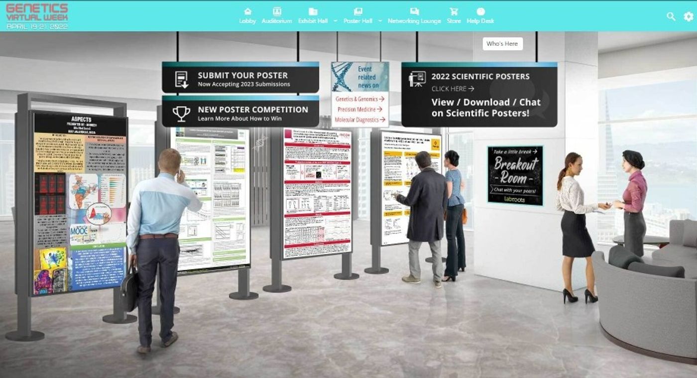
How to Design an Effective Poster for Virtual Conferences

Posters presentations have many benefits for the authors and the audience. The author is free from the constraints of time slots and public speaking while still being able to share their research with the audience they want. The audience can take their time reading and reviewing posters that catch their eye and can connect with the author in person or via email if their contact information is listed.
With virtual conferences becoming a regular feature in the research landscape, posters still play an important role in the sharing of scientific innovations. Many elements of an effective in-person poster presentation hold true for online poster presentations, however there are some new things to consider before submitting a poster to a virtual poster hall.
When designing your poster for a virtual audience consider these tips:
- Organization
- A poster is essentially a miniature version of a research paper, or an oversized abstract, and should include condensed versions of the standard elements: Introduction, Hypothesis(es), Methods, Results, Conclusions, References.
- To avoid the dreaded ‘wall-of-text’ problem, it’s best to keep each section as succinct as possible. About 100 words per section works as a good guideline, with no more than 800 words maximum on your poster.
- Don’t forget your references. While can be smaller than the rest of your text, and often are condensed into one small area of the poster for review at a later time, they are still necessary.
- Following this format reduces reader confusion and can improve the efficacy of your poster.
- A poster is essentially a miniature version of a research paper, or an oversized abstract, and should include condensed versions of the standard elements: Introduction, Hypothesis(es), Methods, Results, Conclusions, References.
- Design
- Many companies and academic institutions have pre-prepared poster templates that you should be able to freely use as an affiliate of that institution. If not, there are free poster templates available from many reputable sources online including Microsoft and Adobe. You can also opt to design your own poster by using free or paid software programs that support larger file formats.
- Posters are typically organized into vertical columns or horizontal rows (depending on the orientation of your poster).
- Having distinct sections that can be easily followed in a linear direction makes it easier for a reader to follow your process from start to finish.
- Avoid overly noisy backgrounds. While it may be tempting to add some flourish to your poster with an interesting background image, this can make it hard to read your poster.
- Text
- In person, the text of a poster must be legible from a distance. In a virtual environment this still holds true to some extent. Depending on the platform used, a viewer may or may not be able to zoom in on your poster. Find out beforehand what the case is by attending a previous event or inquiring with help desk/event organizer.
- If zoom is possible, you have a bit more leeway with your text font size, however the ideal remains a size 24 for text and 32 for titles.
- If zoom isn’t possible, it’s more important to stick to the above font sizes. The last thing you want is for your poster to be unreadable unless it’s downloaded for later. While many users will download posters for later viewing, it may detract from your ability to network with viewers in real-time or live sessions.
- In person, the text of a poster must be legible from a distance. In a virtual environment this still holds true to some extent. Depending on the platform used, a viewer may or may not be able to zoom in on your poster. Find out beforehand what the case is by attending a previous event or inquiring with help desk/event organizer.
- Images & Figures
- Images, graphs, figures, and tables are key poster elements. You can say more with one figure than with 100 words on your poster. Don’t be afraid of color here, images on posters are often what catches the eye of the potential reader.
- Balance between text and image is integral with posters. Try not to have too much of one or the other or the poster can look crowded.
- Make sure the size of your image is optimized for online viewing. The last thing you want if for your figure to be blurry or pixelated when viewing online.
- Networking Tools
- In person you can leave business cards or fliers with your poster. Or, if you’re standing next to it, you can interact with readers directly. Virtually, poster session networking can work a little differently, but can be just as effective if you play your cards right.
- First, make sure your contact information is somewhere easily visible on your poster.
- Then, see what networking features the online event supports. Is there a networking lounge? A live chat? Can users comment on your poster? If so, be prepared to enter these environments to engage with others and promote your poster. The easier you make it for people to interact with you, the more engagement you will get.
- Does the platform have options for an audio/visual element? If so, consider uploading a brief audio introduction about yourself and your research. When done right this can make a poster stand out in the mind of a reader and can help them get to know you and your project faster than reading through the entire poster in that moment.
- Don’t be afraid to promote yourself on your poster. Consider adding links to your lab, your publications, a project website, or a virtual business card. QR codes can be effective in person and in virtual environments to give readers more information. Sites like Link Tree and Campsite also make it easy to link all your project publications & information in one place.
- In person you can leave business cards or fliers with your poster. Or, if you’re standing next to it, you can interact with readers directly. Virtually, poster session networking can work a little differently, but can be just as effective if you play your cards right.
Figure 1: The Labroots Campsite page. Sites like this can be freely used to create online business cards and lists of relevant project links to provide your readers with extra resources.
Virtual poster halls are a great way to get your research out there. Like in-person poster sessions there are many factors -as noted above- that can help your poster succeed. As the landscape perpetually shifts to include more hybrid and virtual events it is important to adapt to new methods of presenting your data. While many aspects of poster presentations remain the same as in person (organization, format, elements), other aspects have intrinsically changed (engagement & networking).
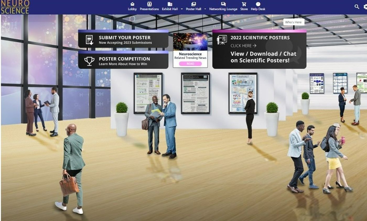
Figure 2: Labroots Virtual Poster Hall for our Neuroscience 2022 Virtual Event.
To see examples of effective poster designs, check out our Poster Competition Winners or register for a free Labroots account and 'walk' our virtual poster halls in any of our upcoming or on-demand virtual events.
Labroots virtual poster halls have built in networking features as well as the option to add a video link, providing a visual for attendees, showcasing you presenting your research poster. Read more about our free poster submission process and see a list of our poster competition winners for previous events here.
Watch this space for more tips and keep an eye on Labroots upcoming call for posters for our 2022 & 2023 virtual events.


